More Personal Work
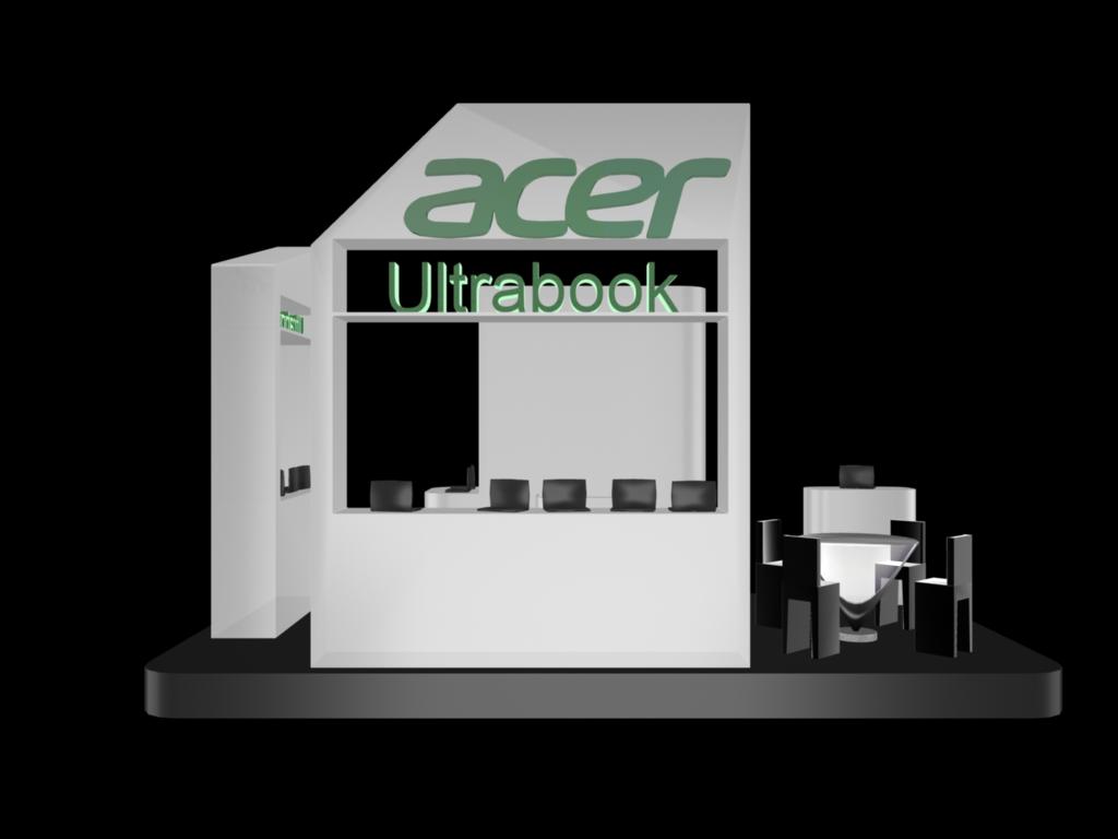
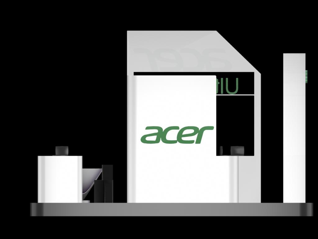
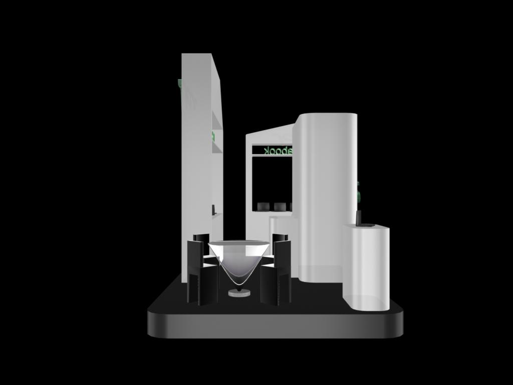
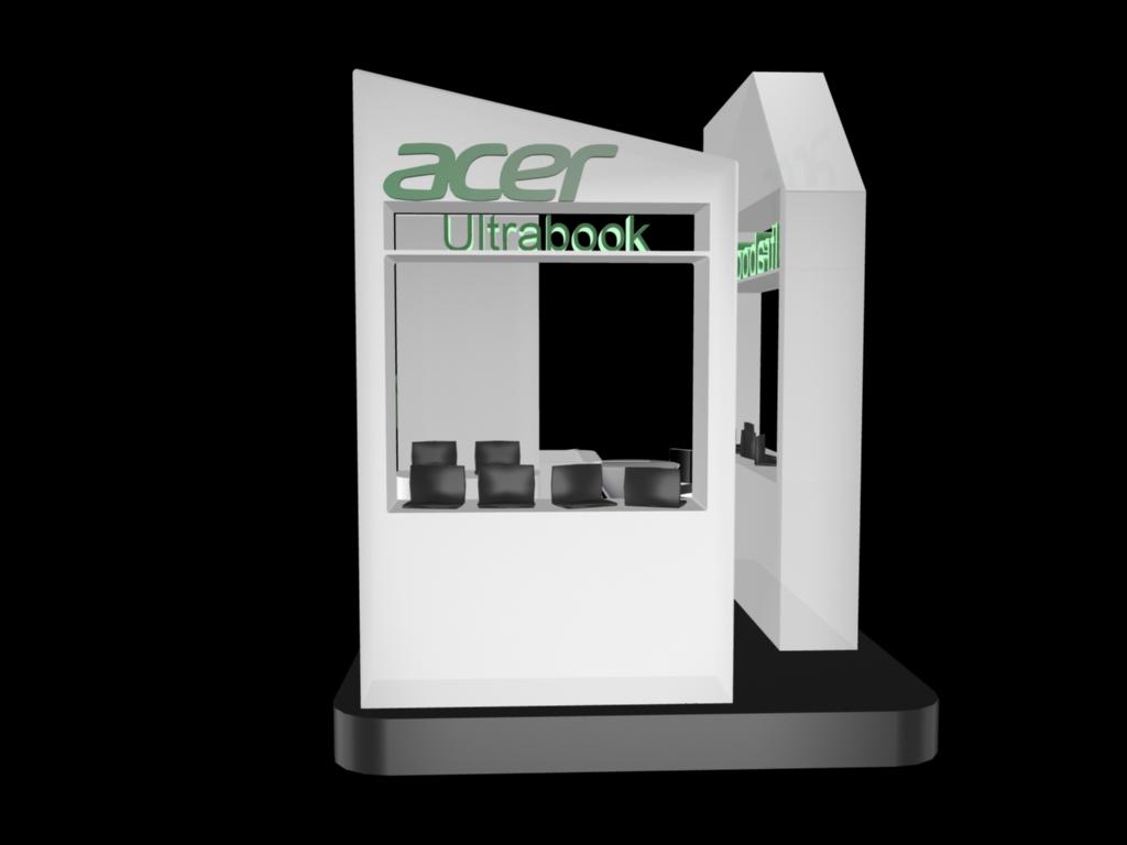
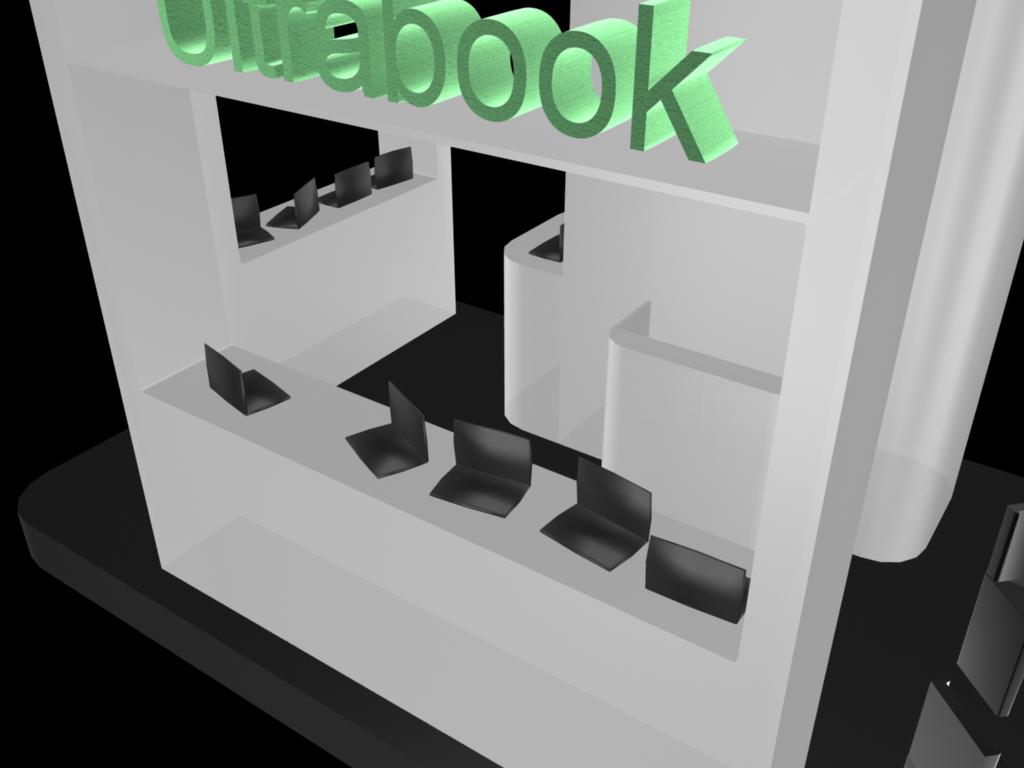

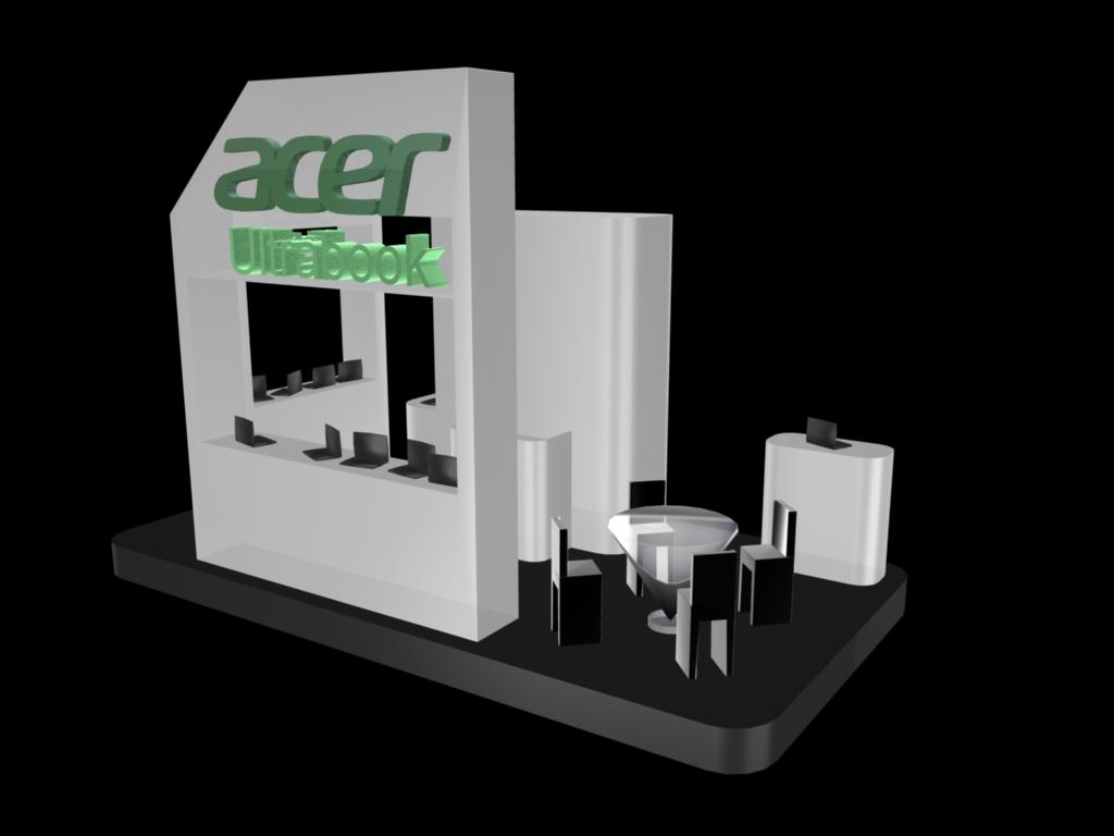
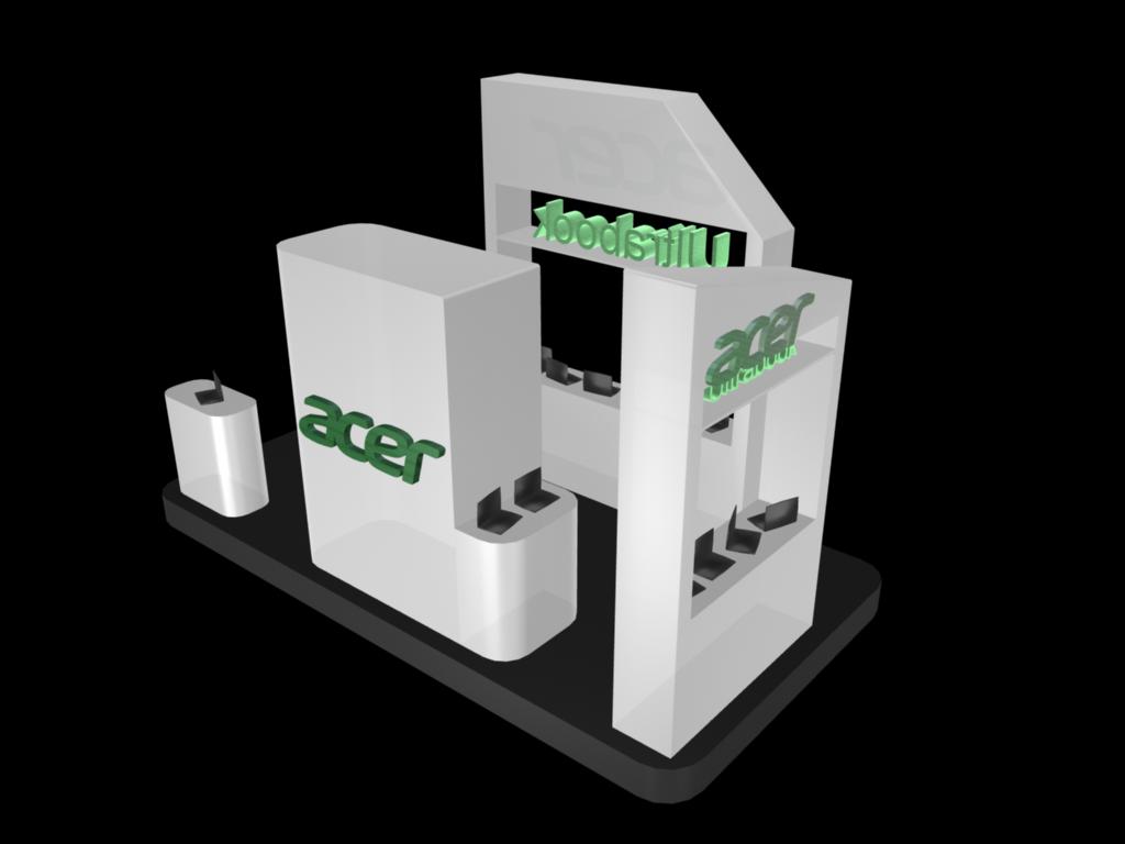
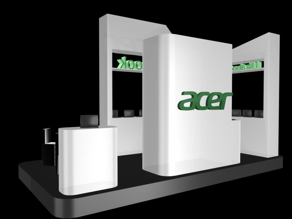
acer Ultrabook
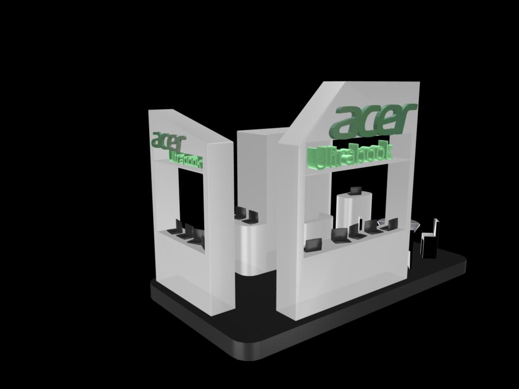
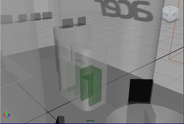
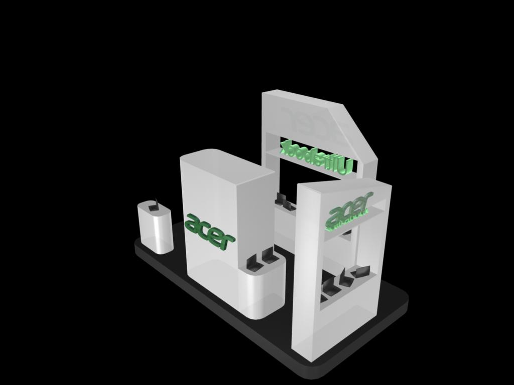
exhibition design
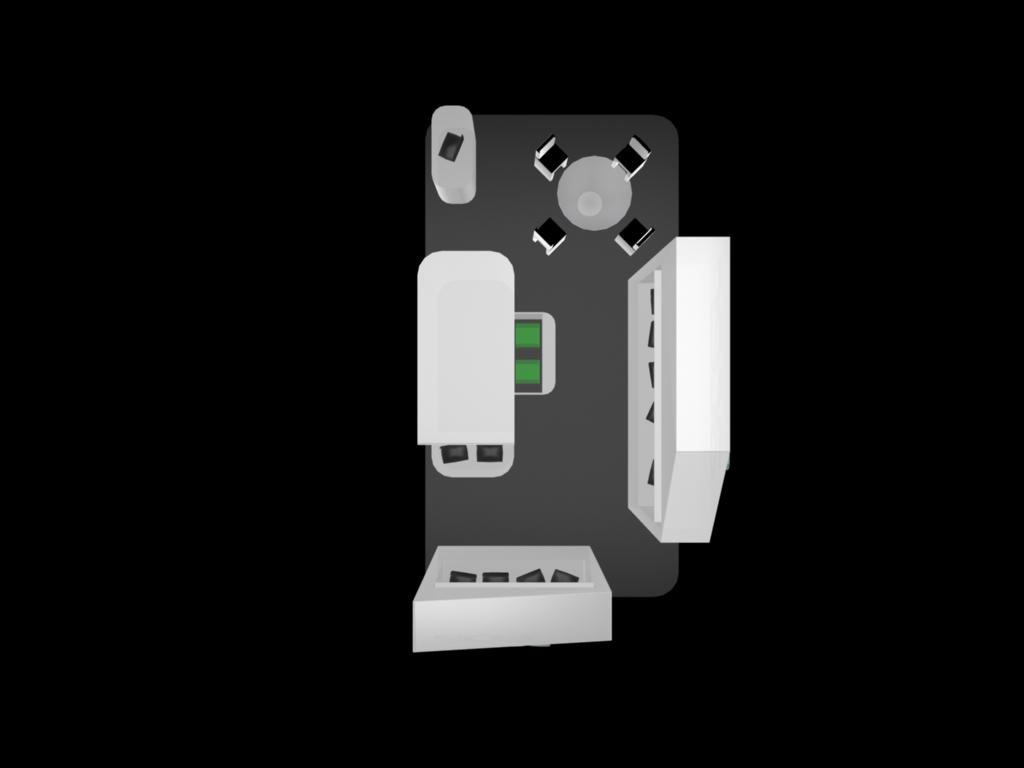
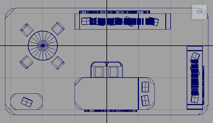
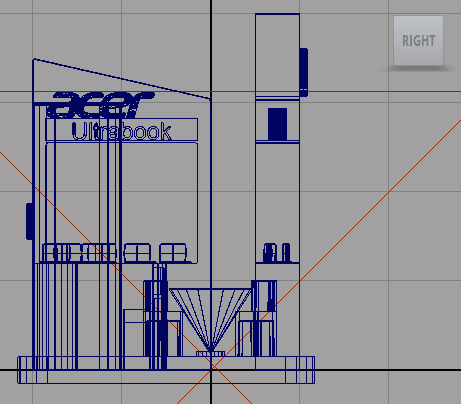
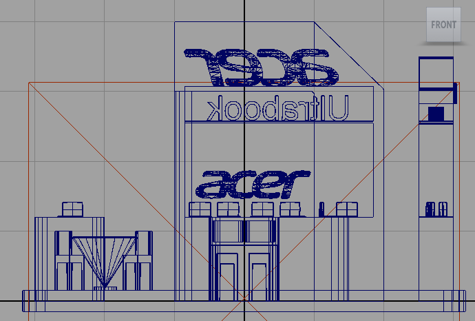
It is a fully open space, with a reception, a meeting area(1 table and 4 chairs), and four interaction areas(12 Ultrabooks). The hollow out design allows audience to try the models either inside the exhibition area or from outside, and it expands the space visually. The main material is 90% opaque matt white, with volume light inside the logo (logo's colour and font follow the design rules of the company). The bevel and legless design trying to set off the features of the Ultrabook, which are light, neat, fast, and innovative. The design tool was Maya.
Special thanks to my teacher of this course, Swan Yang(楊奭凡), who inspired me with his professional and humour. His Design House is one of the best exhibition design companies in Taiwan. ❤
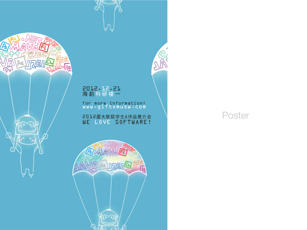
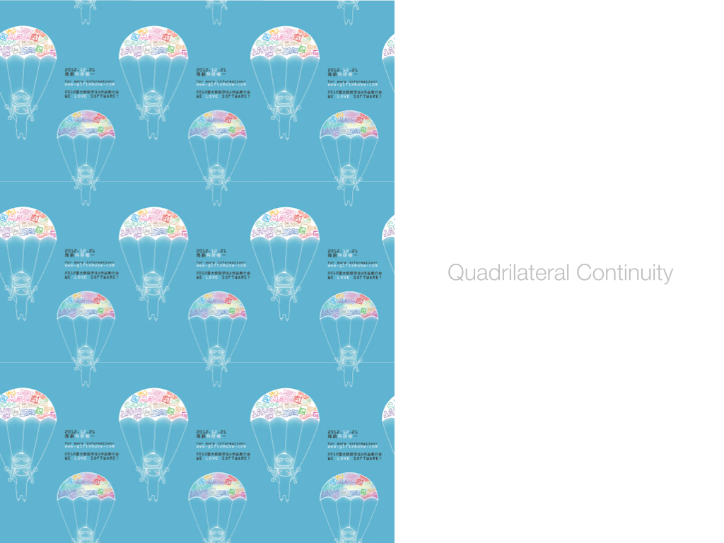
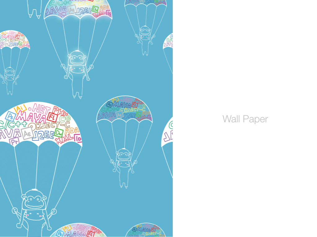
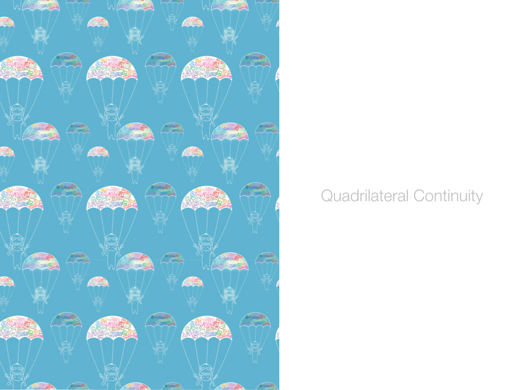
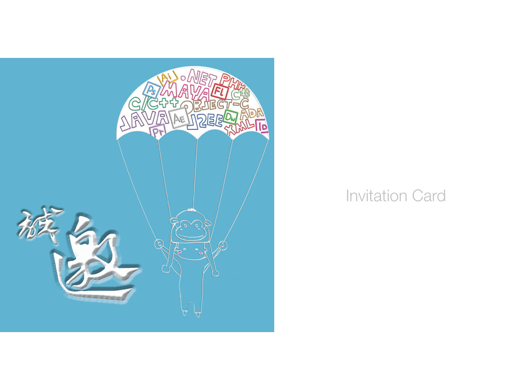
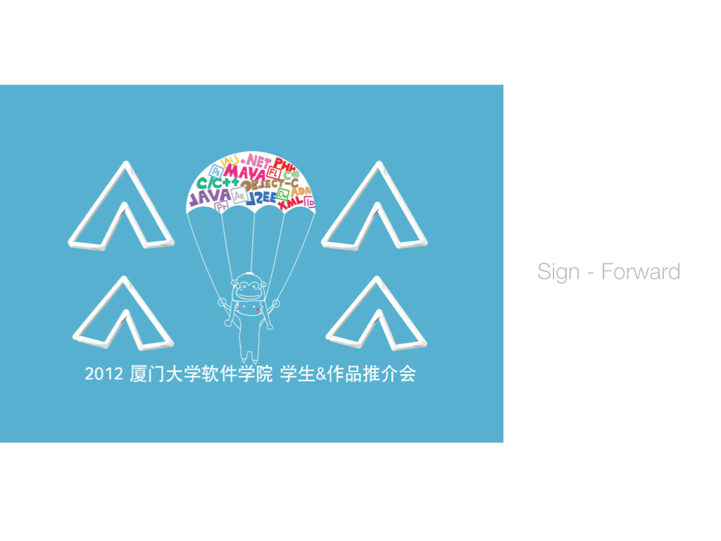
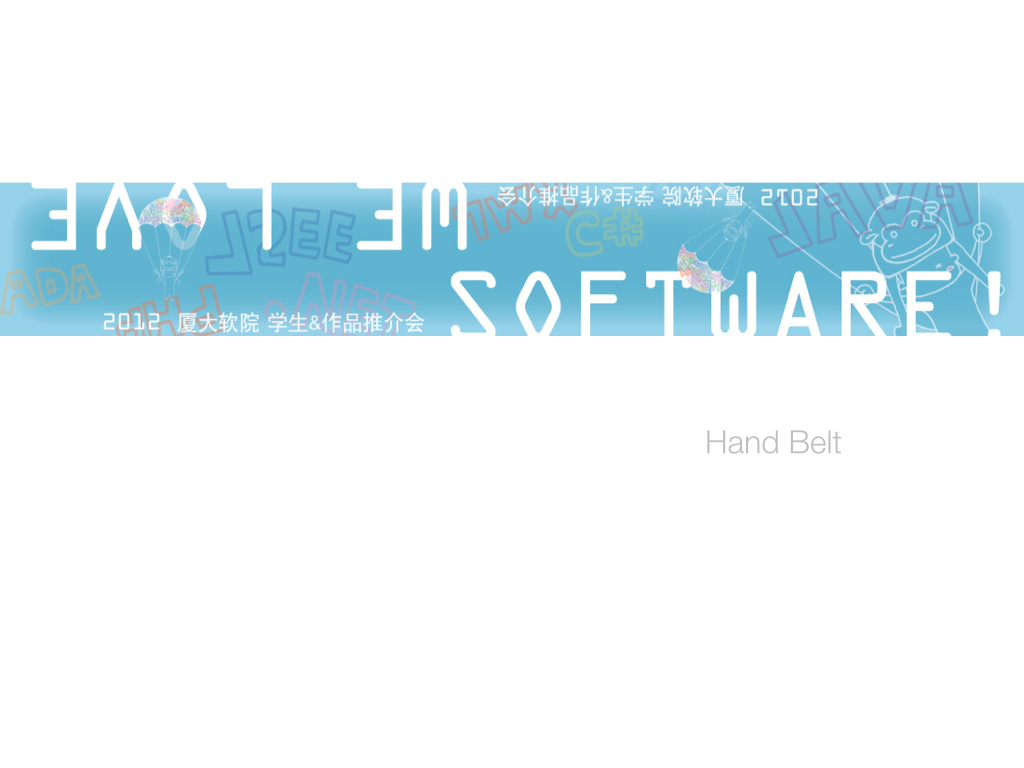
The Parachute
VI design
This set was designed for a degree show, School of Software, XMU. The idea was about graduates landing with their gifts. The labels on the parachute were the skills we got through four years study. The ape hat stood for our career: IT, for the similar pronunciation in Chinese. Quadrilateral Continuity was widely used in this design. The scheme included poster, wall paper, banner, invitation, registration form, signs, and hand belt. This design intended to announce that the new generation was ready to play their roles. ❤


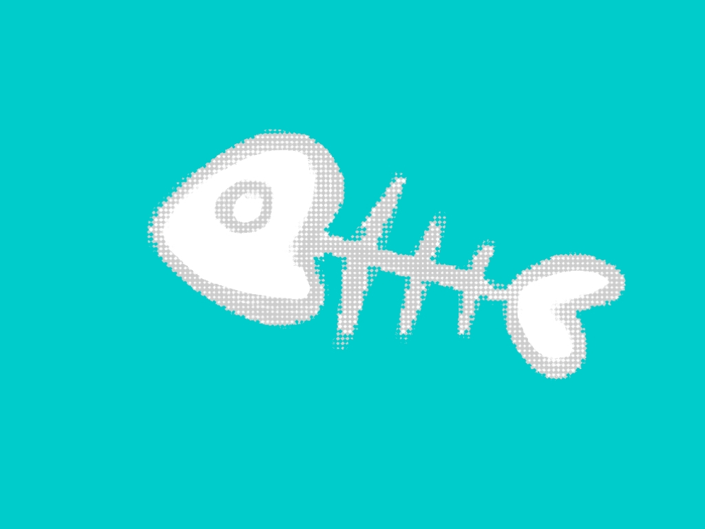
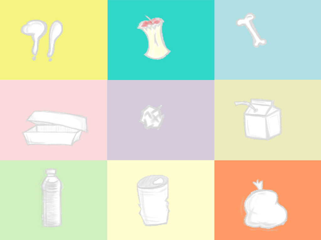
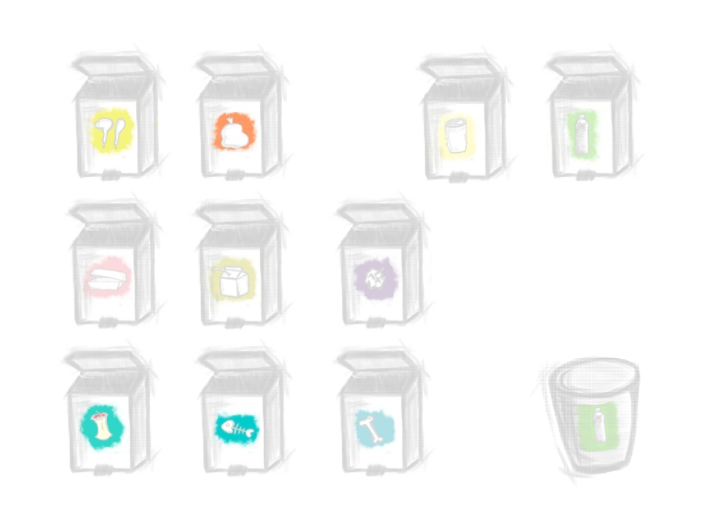
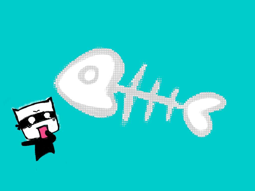


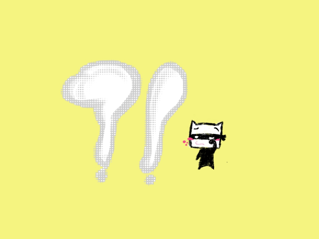
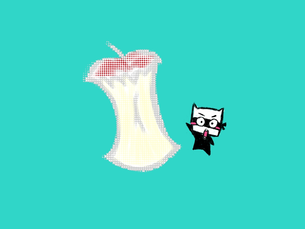
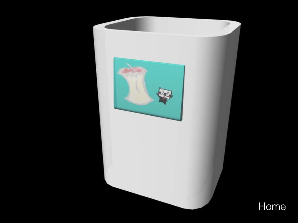
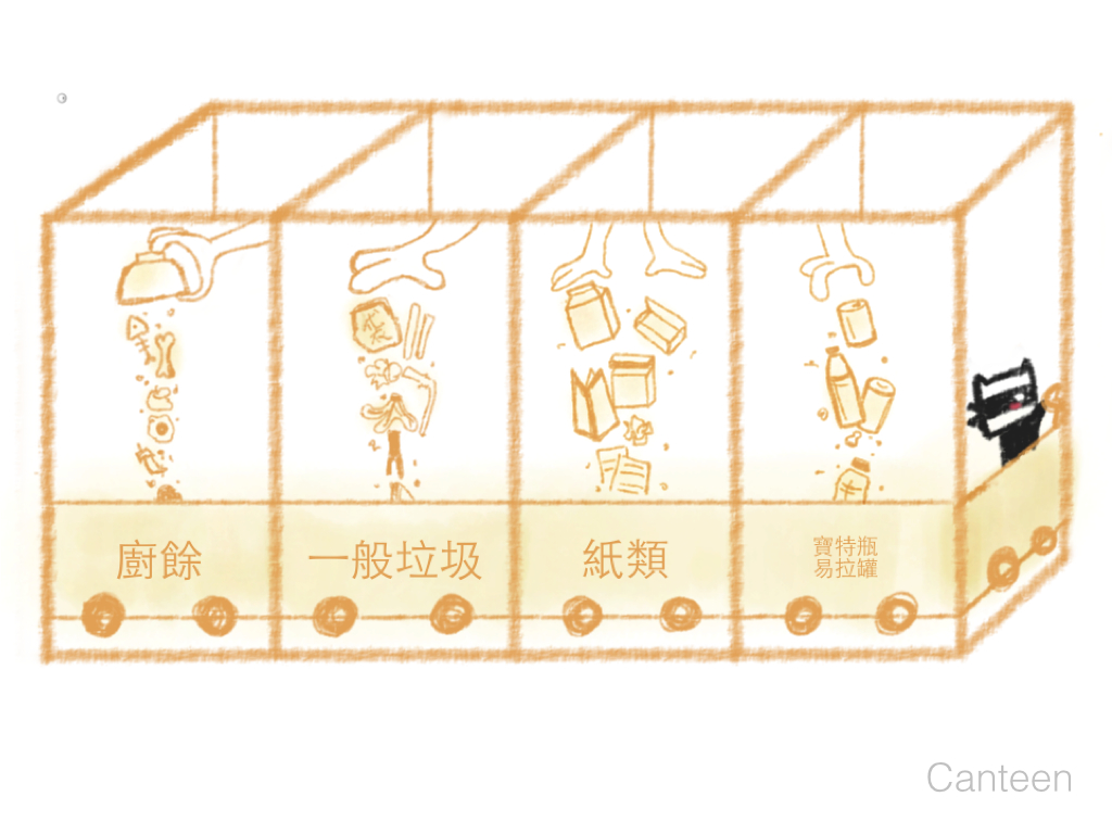
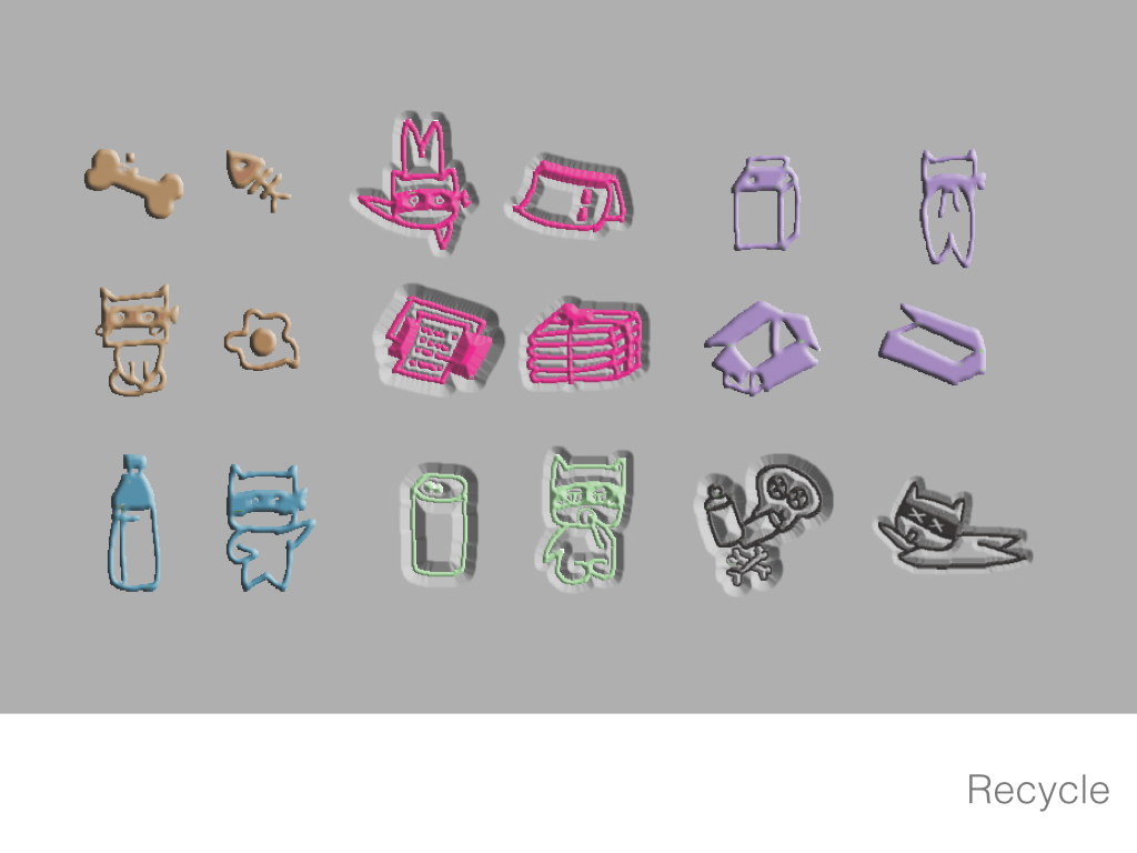
CollectCat
VI design
It was designed for recycling bins. The design tried to help users be clear about recycle items more easily. The concept was simple, there was a group of cats living on collecting rubbish, human beings’ doing recycling in a proper way could help them do a good job. Typical items were selected to represent each category, such as finished apple and fish skeleton stood for rest food, which made more sense than words. Also I tried to use behaviour implies to encourage users to put the rubbish in the right place.
Special thanks to my teacher, Mr.王行恭, who guided me in graphic design. ❤
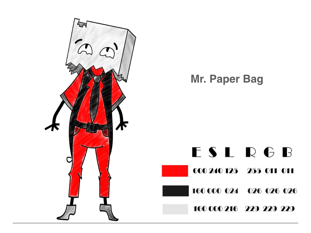
Mr.Paper, Boss Picky
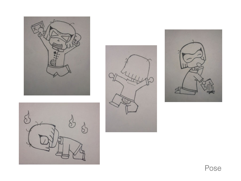
character design
In the course, Character Design, I made two figures, Mr. Paper Bag, and Boss Picky.
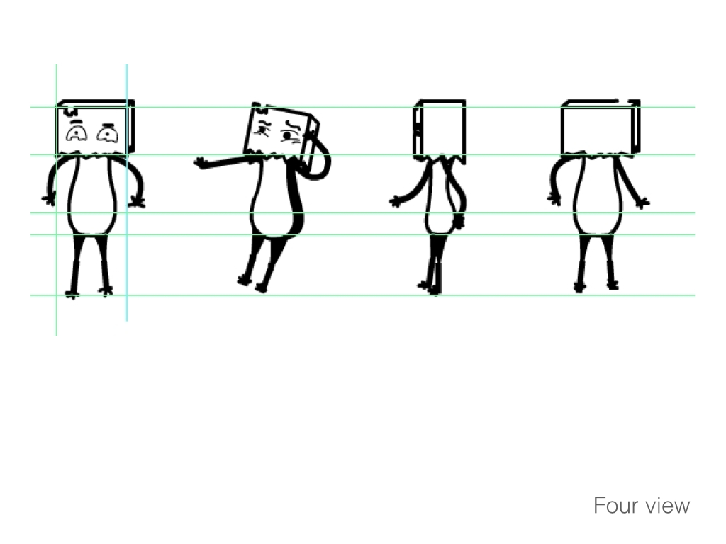
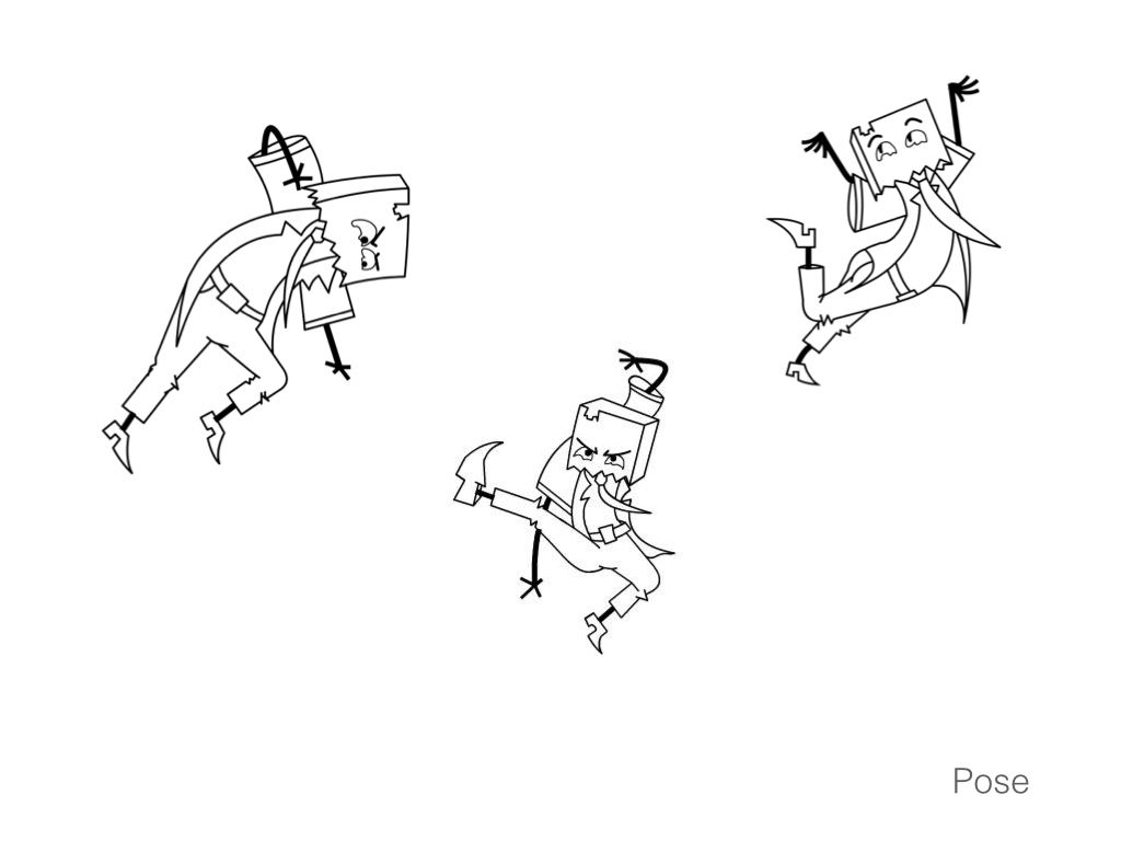
Mr. Paper Bag is a detective, fighting with bad guys. To others, he is not serious at all, but has a warm heart, who is always ready to help. He is good friend with kids while he makes them cry easily.
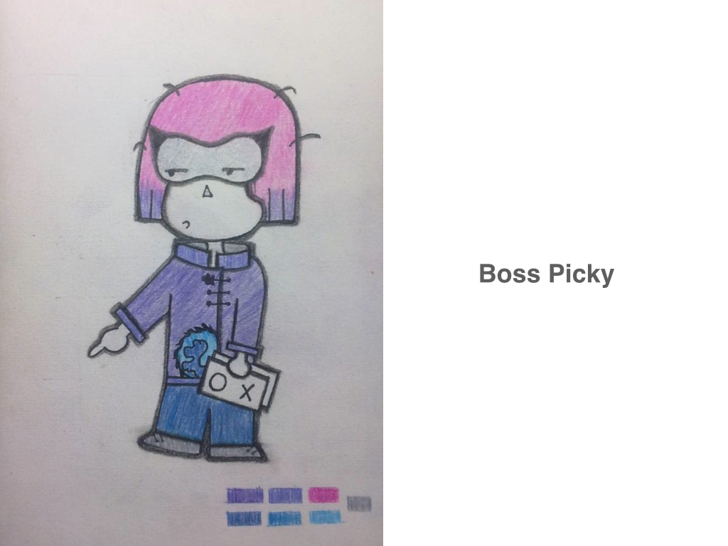
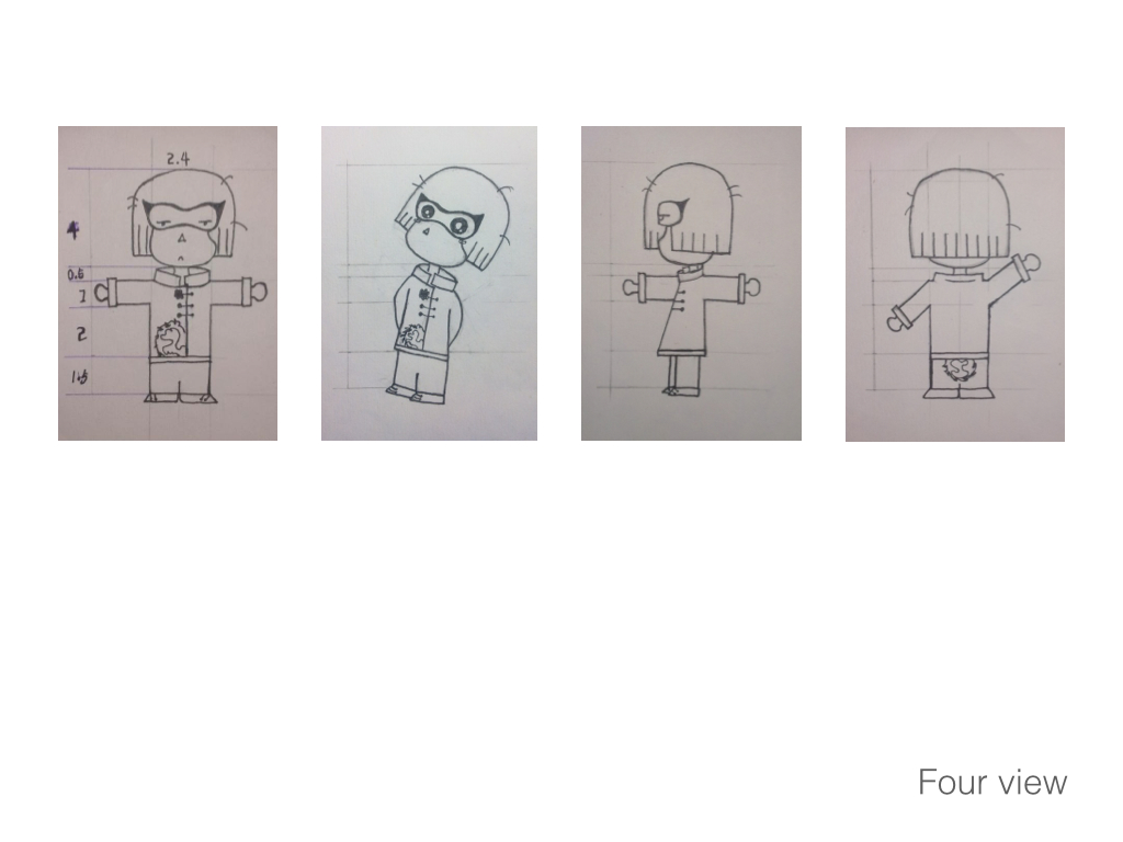
Boss Picky is running his own IT company. He has a small body but a strong brain. He is well-known for his very dramatic behaviours and bad temper. He can destroy anything he is not satisfied with. Even like this, people like him for his talents and super serious working attitude. ❤
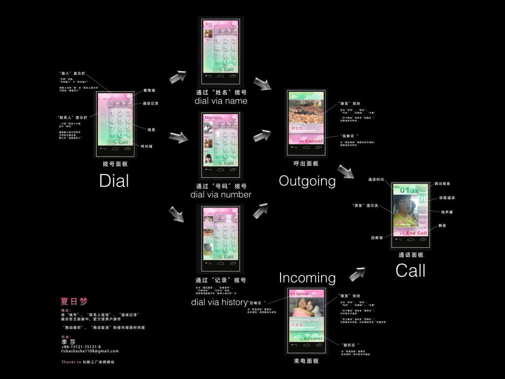
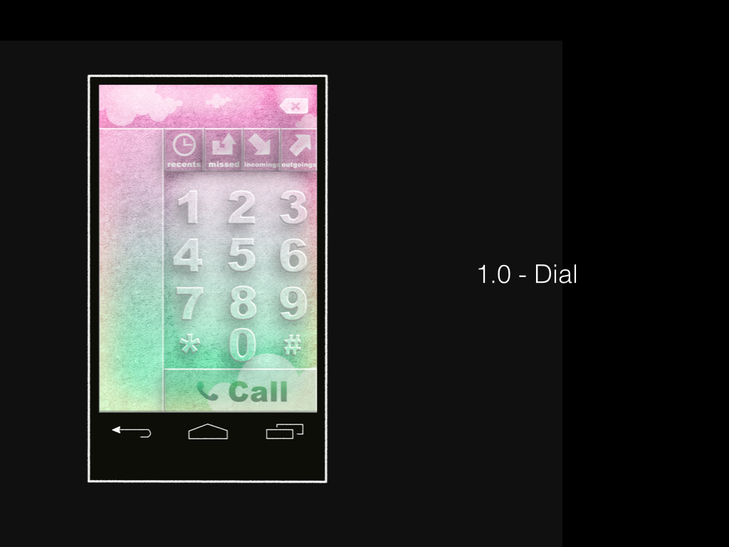
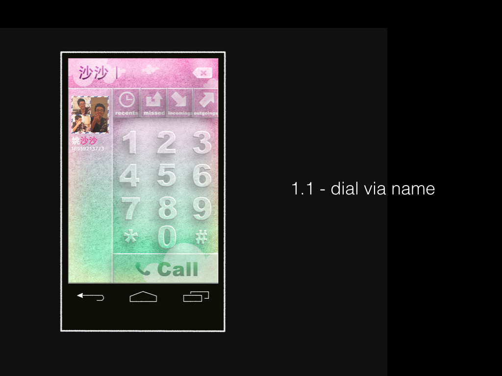


Summer Dream
UI design
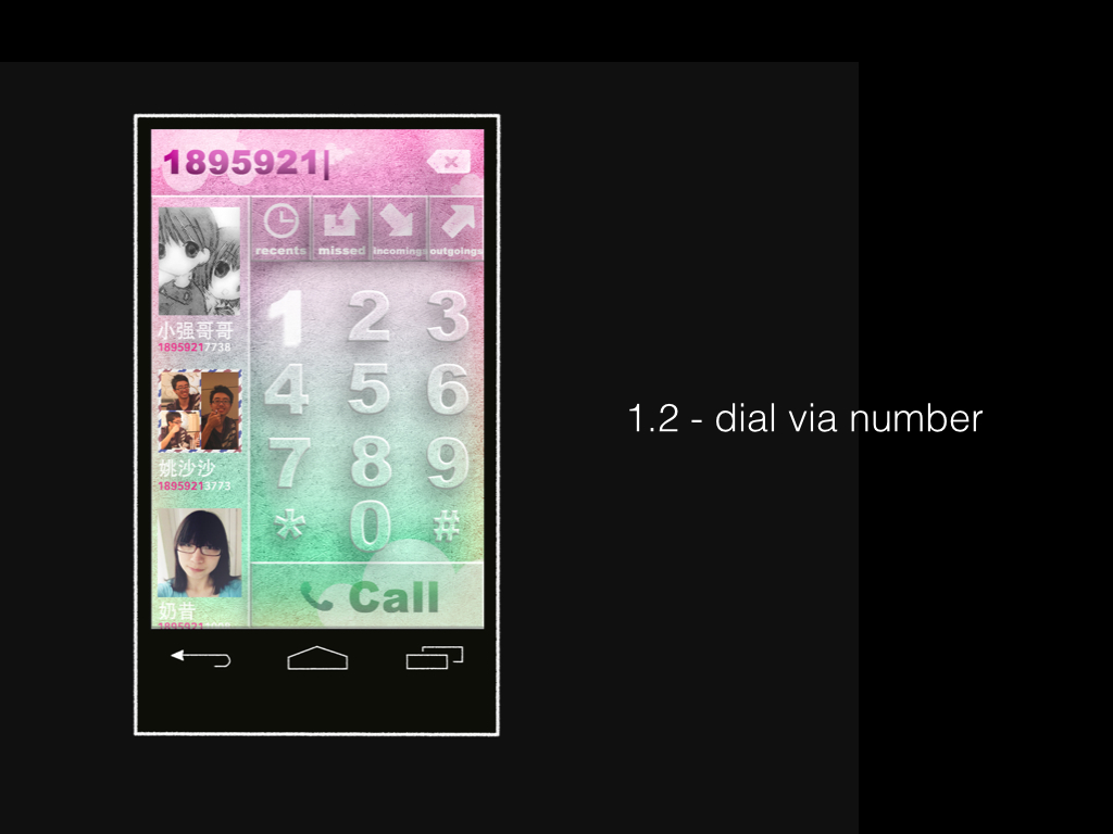
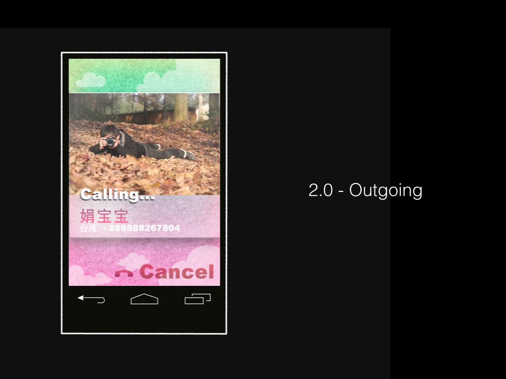
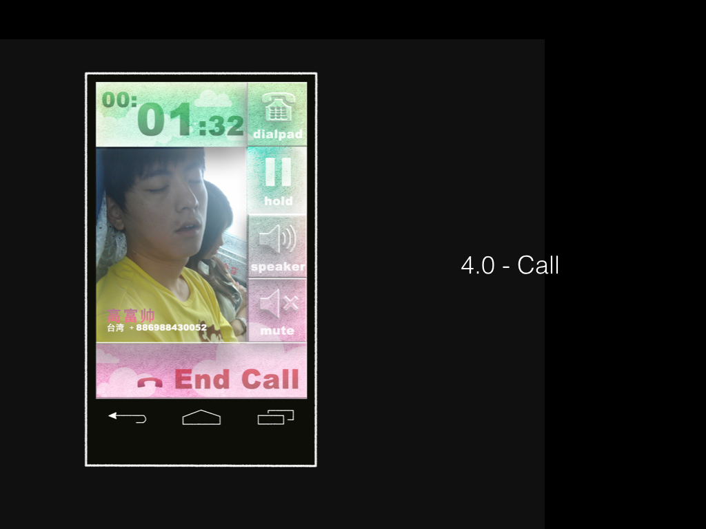
Summer Dream was designed for "Phone" function on android phone. One feature was merging “dial”, “contact”, and “history” into one panel, so that users did not have to switch pages from one function to another. Another feature was slider control, sliding up to answer, and sliding down to ignore. The aim was to avoid cases where users touched the button by mistake. ❤
Odesign Logo
flash animation
I met two lovely girls in Taipei when I was an exchange student there in Spring, 2012. We formed this "studio" in one course. It was really awesome experience. After the brain storm, we decided to use this one as our logo, then I made the animation . ❤
